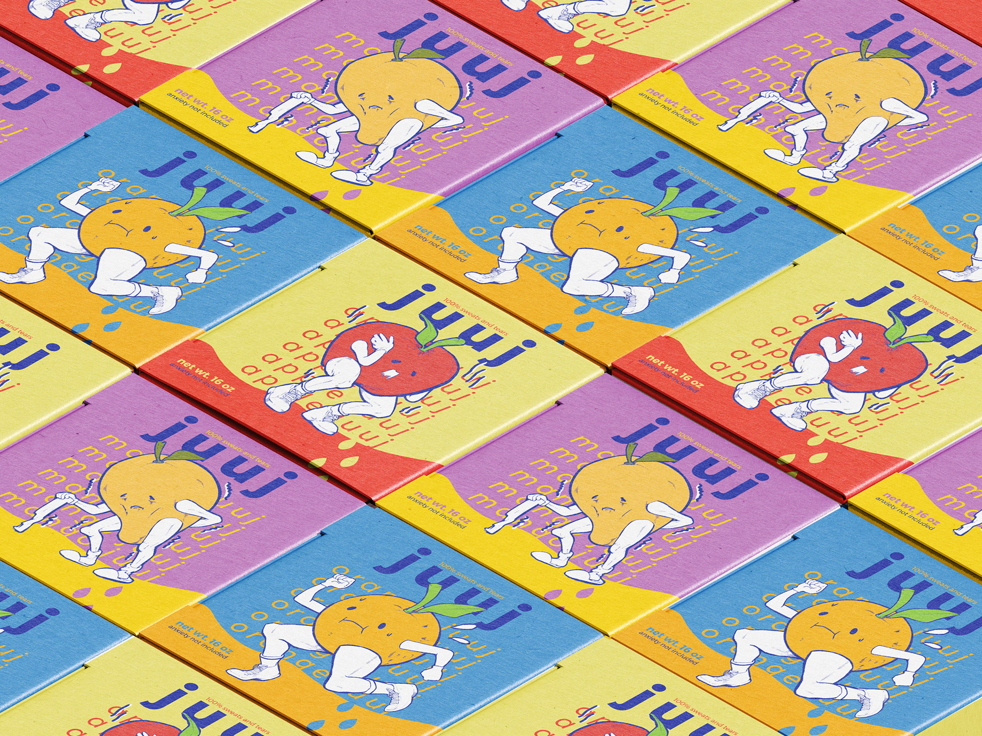
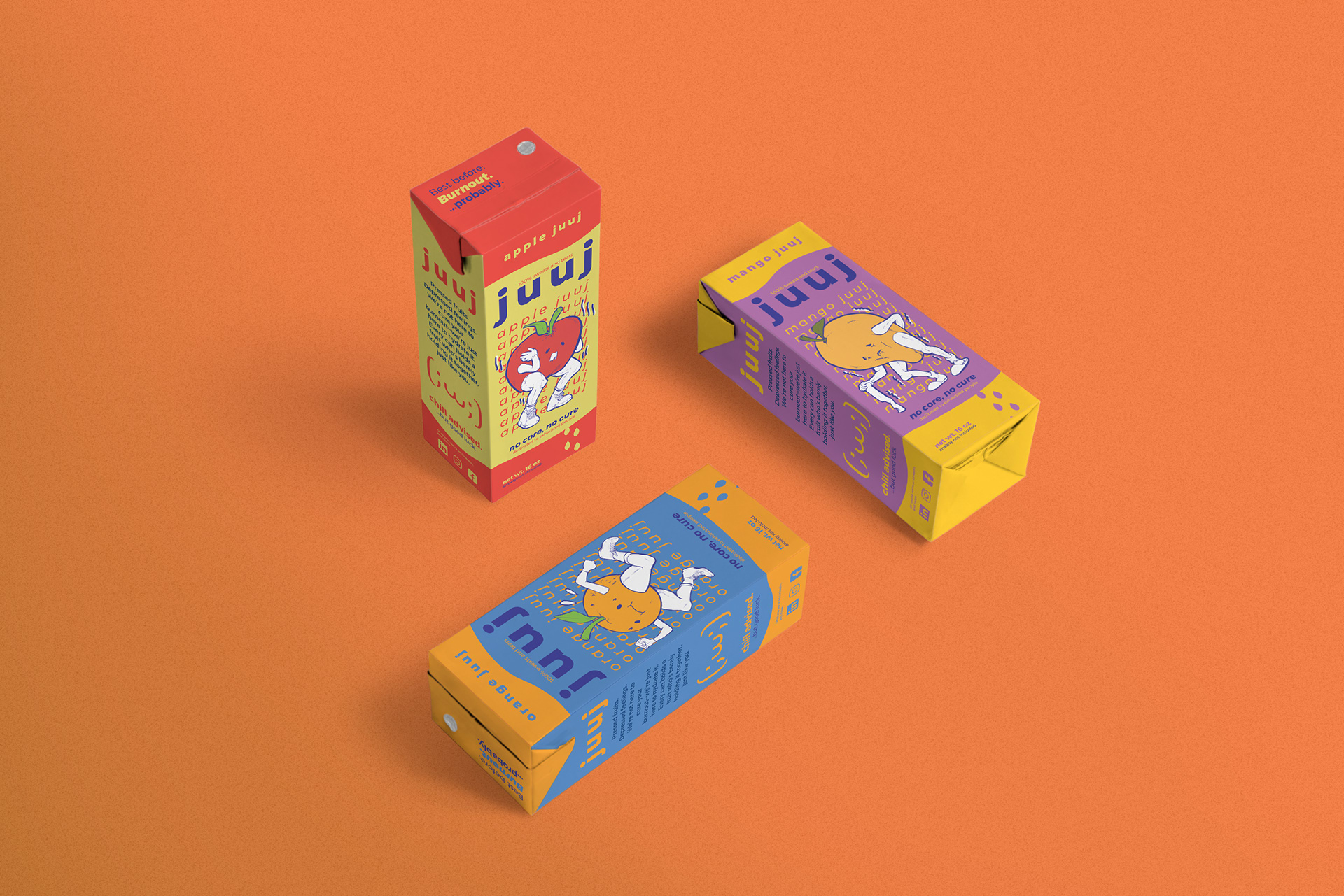
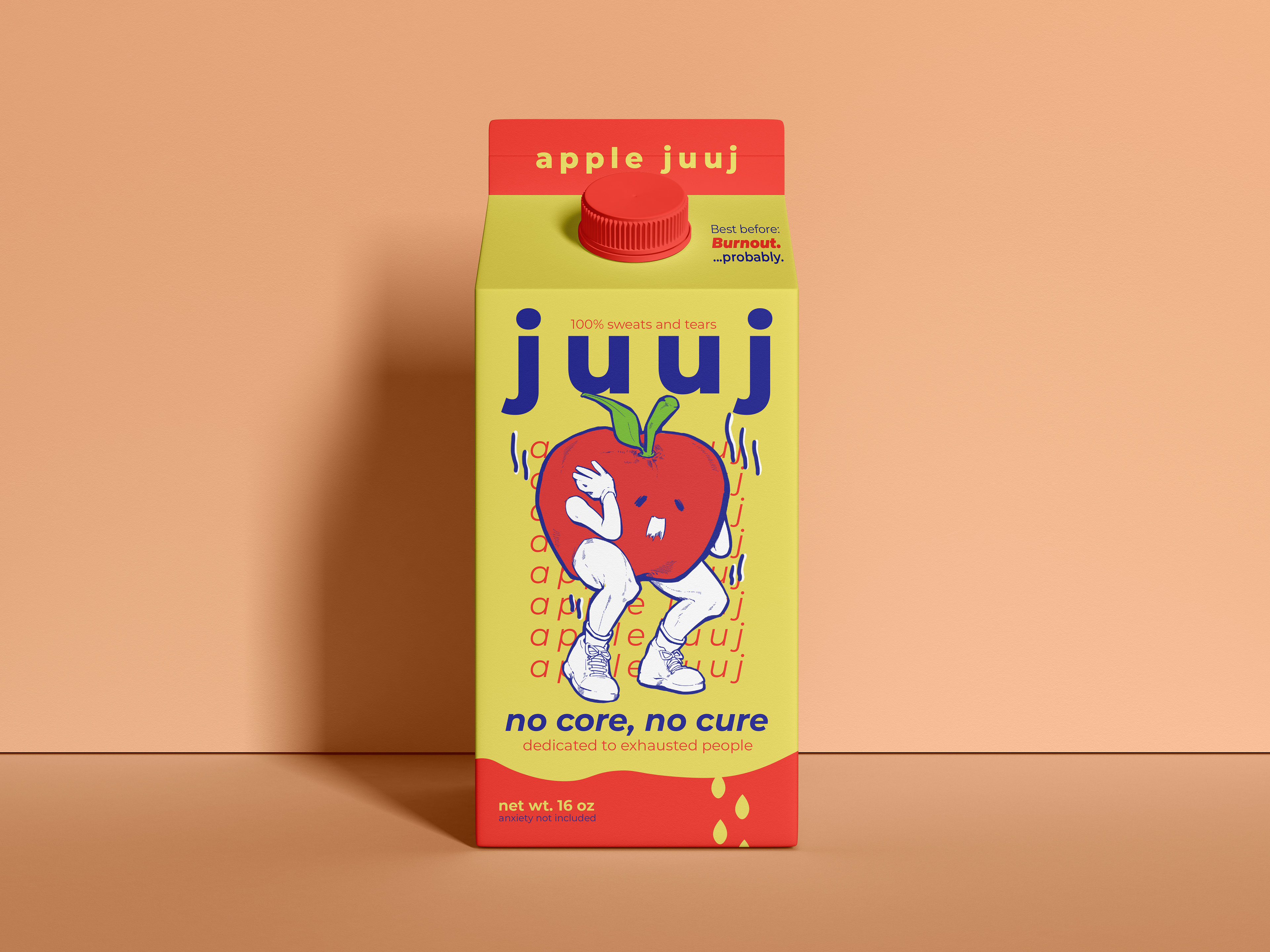
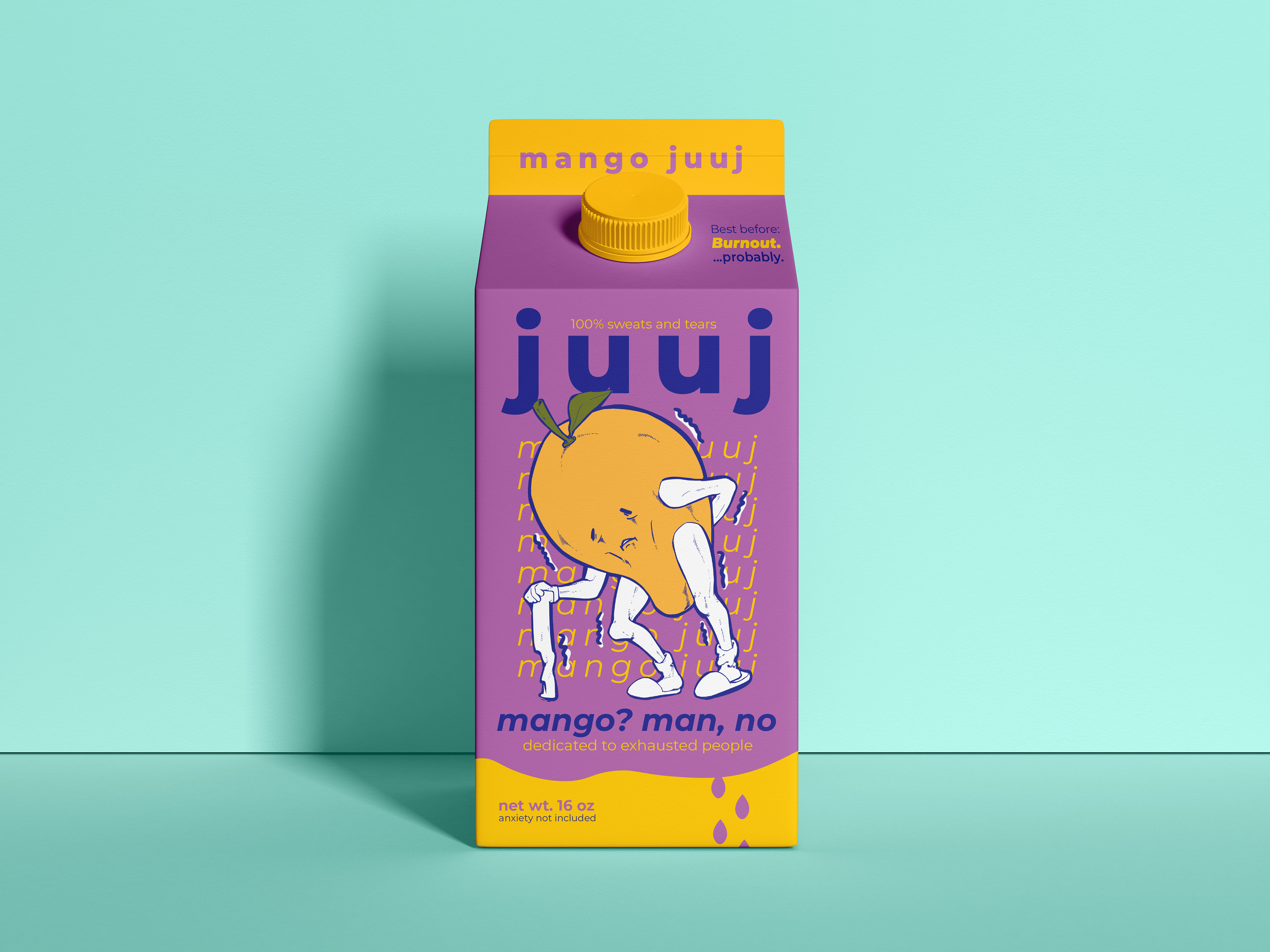
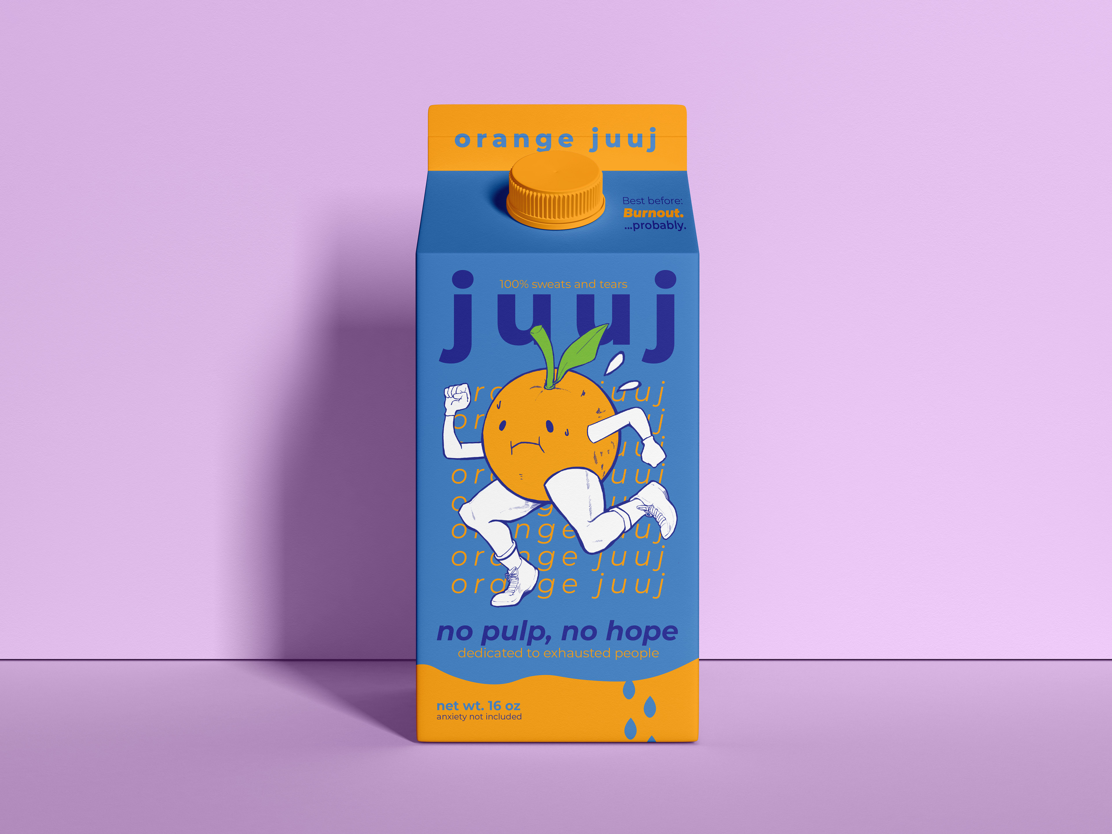

This project is a satirical take on today’s toxic optimism pushed by mass media, where everyone is supposedly “doing amazing,” wearing a “big smile,” and “loving life.” The juice packaging, branded “juuj” and inspired by the crying kaomoji “;w;”, serves as a gentle pause: An exhale, a comma in our busy lives. It conveys a simple message: it’s okay to be tired, burnt out, or even a little mean sometimes. If anything, these fruits will sit with you through your darkest moments. Let’s allow ourselves to be sad.